Some of the most powerful tools you can bring to your career aren't a perfect GPA or well-designed resume, they're curiosity and experience.

Lessons Learned from COVID-19
User experience design (UX), the process of crafting a user’s experience of a product or service, is critical to every industry, but it serves a special place in healthcare. People might be ill or distressed when visiting a provider’s site, which means any hidden or misplaced information could result in a lost prospective patient, and a lost opportunity to demonstrate your expertise and credibility.
Following the coronavirus outbreak, we had the opportunity to revisit core UX principles of healthcare clients, who required rapid modifications, and additions, to their sites. A core component of this new messaging was encouraging patients to notify their providers of COVID-like symptoms and to reschedule via telehealth appointments for physical or mental health reasons.
This pivot in messaging, and its organization, was not just a time-sensitive task with short-term impact. Rather, it was a microcosm of the effect that telehealth and user experience design would have on patients, providers, designers, and product managers in the healthcare and technology sectors.
Thought leadership tactics facilitated with UX design
As self-quarantine orders loomed, we installed COVID-19 alert modules (header banners) on multiple sites directing visitors to updated hours, visitation procedures, and the CDC’s evolving guidelines. While most businesses opted for a COVID-19 banner, being not only responsive but informative was a consumer expectation for the healthcare industry.
It was especially important to make sure the information was regionally relevant, considering how widely re-opening dates and procedures varied across the country.
As an example, USFC frontloaded their homepage with COVID-specific content, and diversified entryways with buttons and links.
The COVID outbreak also spurred a wealth of content marketing resources from distinguished medical institutions. Each organization we studied responded to COVID with robust multi-media content programs ranging from extensive FAQ pages to scholarly research.
UCLA Health also showed multiple entry points into the site to access COVID-19 information from the initial header banner, the hero module, and various buttons.
As for a multimedia approach, Massachusetts General Hospital addressed key patient, and general consumer, concerns through video content. In a Q & A, Mass General physicians answered common questions regarding COVID-19, such as protective measures for individuals and families, both to educate audiences and alleviate some of their worry. Mass General also provided the full transcript on their COVID FAQ page to reach additional audiences.
The classic challenge in UX is balancing critical information with aesthetic appeal, as a poorly designed interface exudes lack of professionalism. From button size to text fields to hyperlinks, every element needs to be strategically placed to align with user intent.
The benefit for each of these institutions in making their expertise readily accessible is that they earned trust in the hearts and minds of readers looking for answers. As a result, each entity solidified its place as a thought leader in the healthcare sector—a crucial ingredient for future patient intake and partnerships.
All of these websites serve the user by being easily navigable and pleasing to the eye, but they also illustrate another key component of UX design: Assets need to be arranged in a way to get users to do what you want them to.
In the case of these hospitals, the placement of visitor policy updates near COVID-19 information is key. This arrangement speaks to the user’s highest priorities (i.e. what is COVID-19 and how do I respond). After the research phase, the next logical step for a user would be to schedule an appointment virtually. Since telehealth services are advertised alongside COVID-19 information, the user has to give little thought about how to proceed with their website visit.
Since these institutions have demonstrated their authority through various content types, they have primed the websites for conversions (i.e. appointment requests) with telehealth as the service vehicle.
Broader implications of telehealth and UX in healthcare
It’s key to note that on the websites of top hospitals, consumerist messaging in the form of telehealth services directly followed the initial display of COVID-related content.
For example, Vanderbilt offered a suite of telehealth features prominently on the homepage, one of which being its HealthOnCall app.
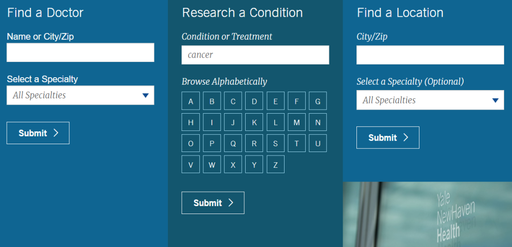
To further demonstrate the consumerist nature of healthcare, one merely needs to look at the services directory for Yale New Haven Hospital. Here exists a hybrid wayfinding system for services, using alphabetization alongside a dropdown menu of specialties.
This design choice also appeals to different user searches, as those who know what they want will likely be able to use the alphabetized section and search bar while those who don’t know the word for their ailment can get assistance with the dropdown menu.
Another aspect that cannot be overlooked is the ubiquity of chatbots, made even more contextual with a reference to COVID-19 in the message box and icon shape. We had a few clients request live chat functionality concurrently with installing COVID-19 alert banners, although the feature is useful for discussing non-emergency ailments in general.
The fact that such a distinguished medical institution devoted a lot of its homepage real estate to online interactions indicates not only current market demand, but foretells telehealth growth.
UX design considerations for the telehealth landscape
Telehealth’s emergence into the UX world has not been seamless, but rather requires greater coordination between designers and healthcare teams to deliver a quality product. A notable UX solution that comes out of increased telehealth usage, whether that’s in a portal or other environment, is an overhaul of traditionally cluttered interfaces like electronic health records (EHR).
An additional layer of crafting the user journey (the set of experience someone undergoes in an interaction) is that the designer or UX writer would have to thoroughly understand the journey (whether through user testing or conducting the journey themselves) that goes into scheduling an appointment, in consideration of the client’s unique processes and legal obligations.
For example, if not all specialties allow for self-scheduling, then the designer would have to create the interface, copy, and CTA buttons for different use cases. Essentially, future-proofing the site establishes expectations of what patients can and cannot do from home to avoid confusion and frustration on the user end, which could cost the client an appointment.
We keep several common consumer actions in mind when designing interfaces from websites to progressive web apps (PWAs), including but not limited to the following:
- Scheduling appointments
- Viewing lab results
- Viewing bills and making payments
- Checking prescription refills and requests
- Filling out intake forms
- Communicating with providers
- Updating medical history
As a note on HIPAA, the variations of telehealth have created additional considerations for designers and developers, since database storage and user access are much more lenient in other industries. Chatbots are subject to HIPAA compliance as well as contact forms, among other tools.
Since ePHI must be kept secure (i.e. encrypted) when information is transferred via a website, usually via a contact form, we consult clients on third-party usage if they do not already have proper parameters in place.
Looking forward
As the patient journey becomes increasingly digitized, telehealth and its UX component will only grow in importance. Every thoughtfully placed module is in the service of enhancing the user experience and fulfilling the desired conversion (i.e. scheduling an appointment), which means that a stumbling block in that journey (confusing directions, illegible text, etc.) could be a patient’s deciding factor for going elsewhere.
Considering that everything from a slider of testimonials to a physician profile is a seal of endorsement to consumers, it’s imperative for web professionals and healthcare institutions alike to be proactive about user-centric design.
While a healthcare journey facilitated or fully orchestrated by telehealth services is already a possibility, making the experience seamless for patients and providers across technologies is a journey in and of itself.
More of our thoughts
Our agency works with many non-profit organizations, and funding for meaningful programs and innovative projects is critical.
While voice and social media continue to influence how we source information, AI may be having the greatest impact.


