
Some of the most powerful tools you can bring to your career aren't a perfect GPA or well-designed resume, they're curiosity and experience.
Direct Mail Doesn’t Have to Be Boring
How We Used Creative and Practical Thinking to Make a Client’s Vision an Affordable Reality
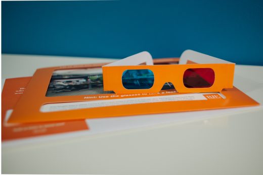
Asher was asked to create a dynamic direct mailer for our client RJE Business Interiors to highlight five of their newer creative office solutions. When this project was brought to me as the print production manager at the agency, it had been concepted and designed by our creative directors, and I was tasked to move forward with production research and gathering estimates for the project.
The piece was originally designed as a slim-line box that had a window cut out on the front/top face to show a reeled-loop of 3-D images and text featuring five individual vignettes of RJE office solutions to be viewed with traditional red and blue anaglyphic 3-D glasses. This reeled-loop was to be seated on a rotating mechanism that could be manually turned to reveal the next design vignette, and so on. After some research, contacting a variety of vendors discussing both functionality and execution, we came to the conclusion that due to the complexity and dimensionality of the design, it seemed like its current incarnation was going to be out of our budget.
I had some further discussions with the AE and got down to the root of what the client was looking for from the piece, as well as what elements they really loved from the original design. With fresh focus I then began to adjust the design of the mailer into an alternative version that combated some of the major budget and design concerns from the initial design concept. First, I converted the slim-line box design to a more flat, top-loading picture frame layout featuring a pop-out easel back to make it function like a desktop picture frame. By making this change the piece could now mail flat in an envelope creating a significant savings in mailing and packaging costs as well as an easier and more cost effective construction. Next, to combat the challenges posed by the rotating mechanism with the loop of images, I opted to use five individually tabbed cards that would insert into the top of the pop-up frame. In moving to this new layout we were able to create a mailer that could be produced in a more conventional fashion all the while keeping the end result unique and impactful.
Since the real fun-factor of this piece was the three dimensional image elements, I sourced custom 3-D glasses to accompany the piece. What I didn’t realize is that the 3-D glasses vendor I was using also made eclipse viewing glasses. Typically this would be no big deal, but in our case the United States happened to be less than a month away from the most widely-viewable full solar eclipse the country had seen since 1979. Although the eclipse was an amazing sight to behold it did change our anticipated two week production timeline to a cool six weeks. Luckily for both Asher and RJE, the mailer wasn’t extremely time-sensitive, so we were able to make the necessary accommodations for all the elements of the design. The finished product ended up better and more fun than I expected, proving yet again that thinking outside the box can still be the way to go.
Written by Kirsten Hamrick Hinkson, Asher Agency Production Manager
More of our thoughts

Our agency works with many non-profit organizations, and funding for meaningful programs and innovative projects is critical.

While voice and social media continue to influence how we source information, AI may be having the greatest impact.